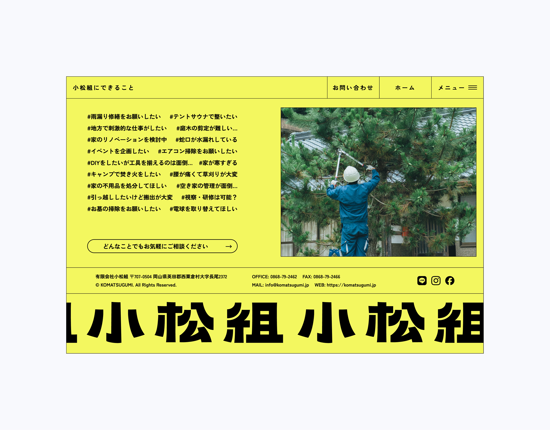
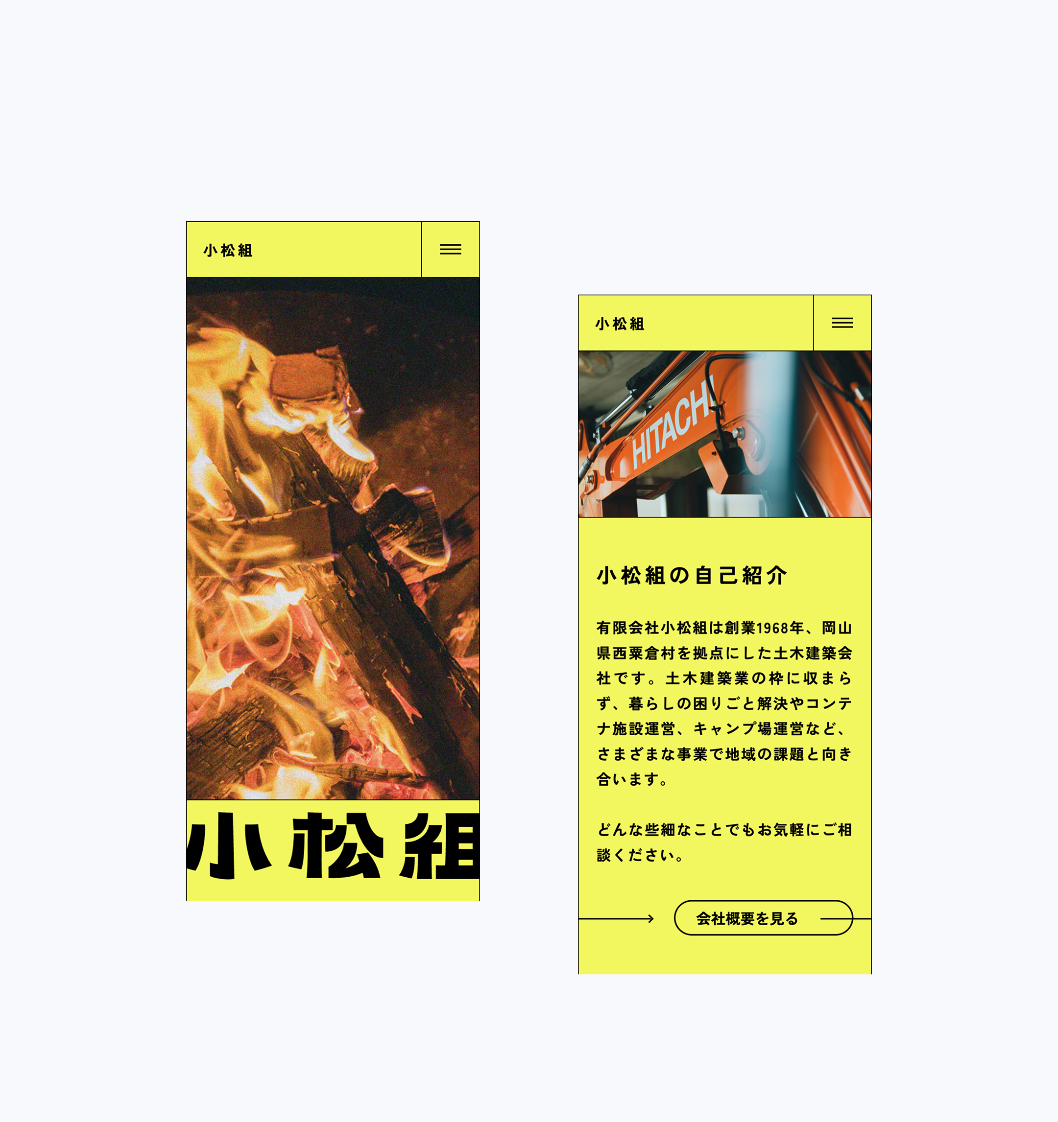
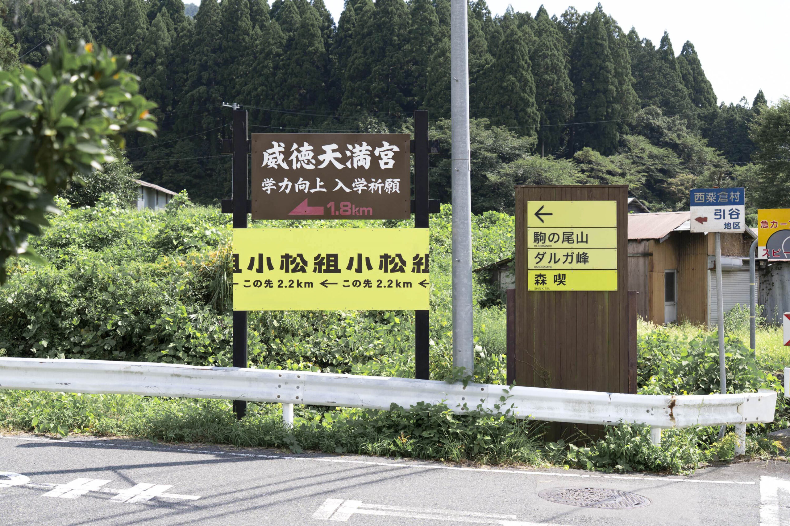
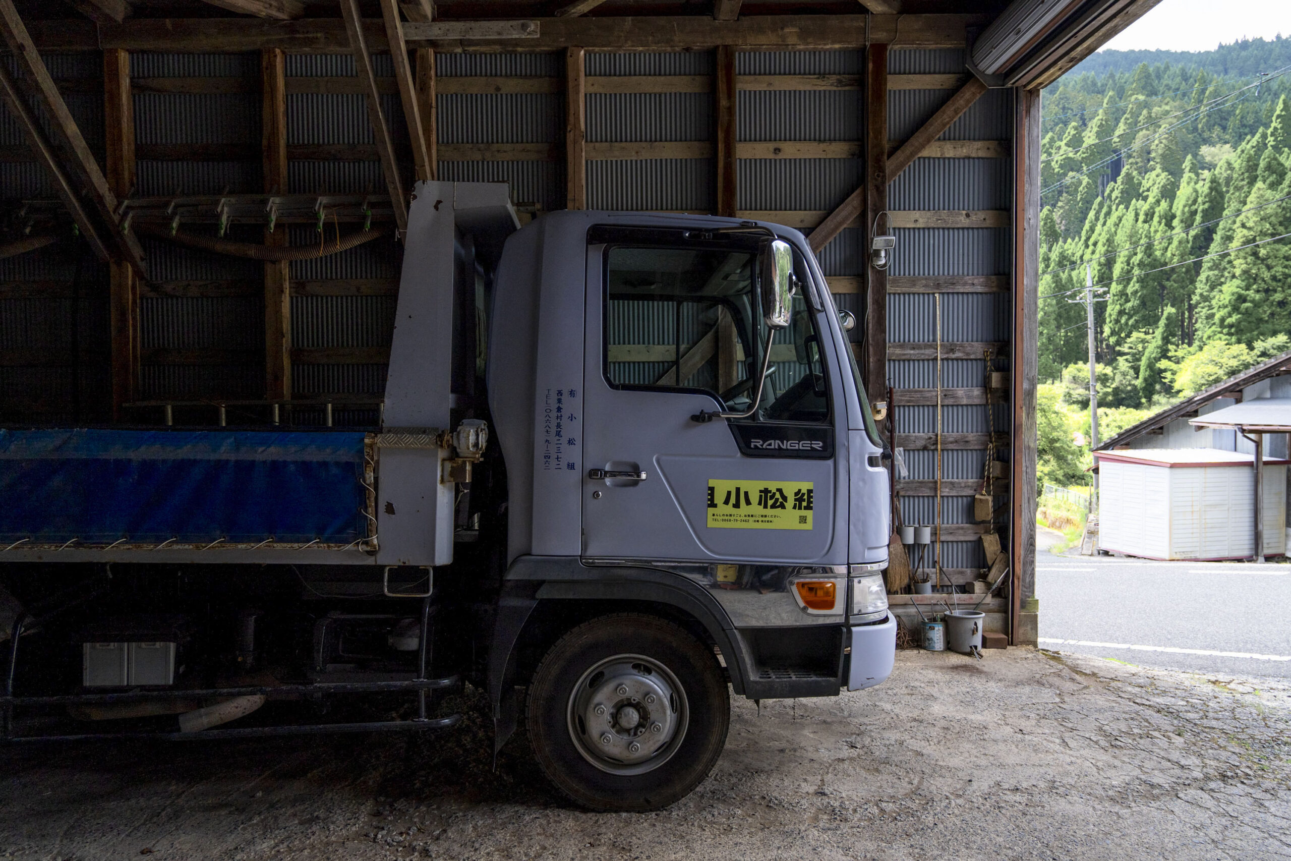
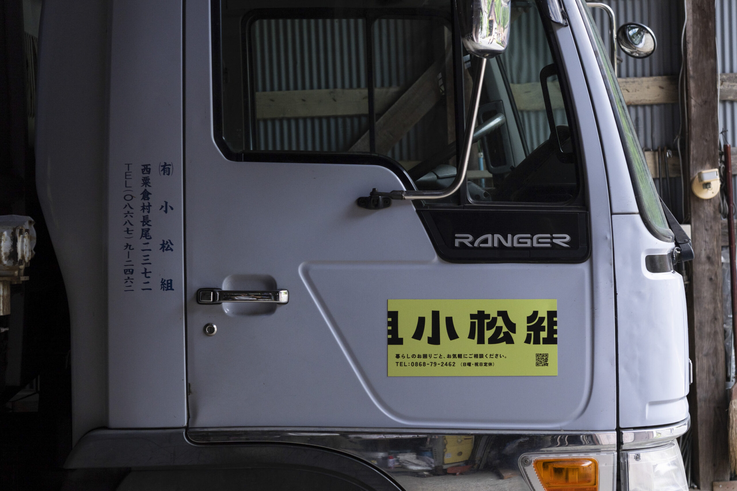
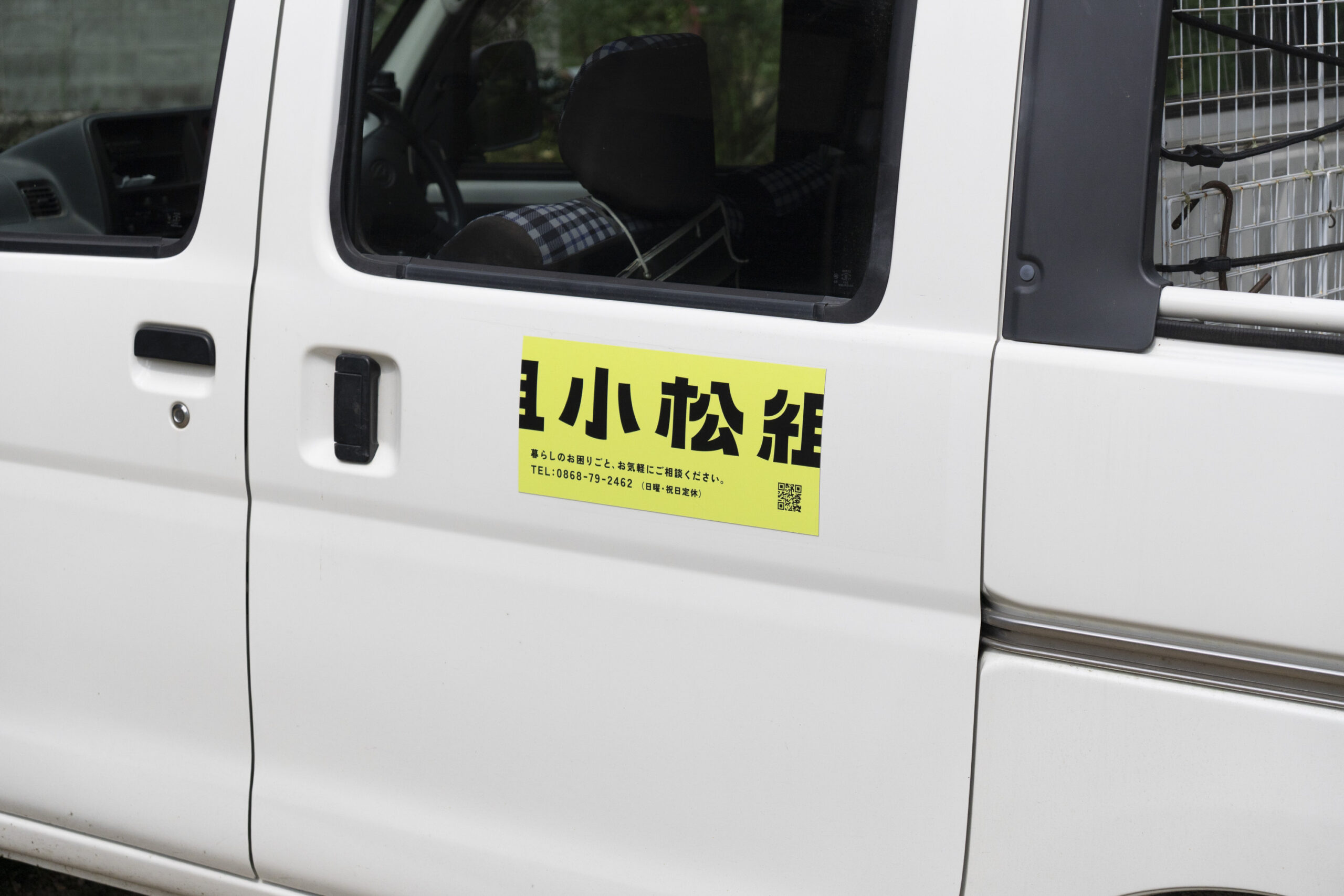
At nottuo, we led the rebranding of Komathu-Gumi, a civil engineering and construction company based in Nishiawakura Village. Our work ranged from defining their purpose to designing the logo, business cards, envelopes, website, signage, and magnetic decals for company vehicles.
Komathu-Gumi had actually worked with nottuo on its branding ten years ago. As we listened to their thoughts on the diversification of their business and their vision for the future, we decided together that the tenth anniversary of President Takato Komatsu’s appointment would be the right moment to embark on a full rebranding.
At the office, President Komatsu is known for meetings that “take at least three hours before he comes back,” and he stayed with us through an interview process that was just as long and intense. Sitting down face-to-face, we spoke at length about his passion and driving force for the business and the village, his dreams and long-term vision, and the new hiring plans that will support that future.
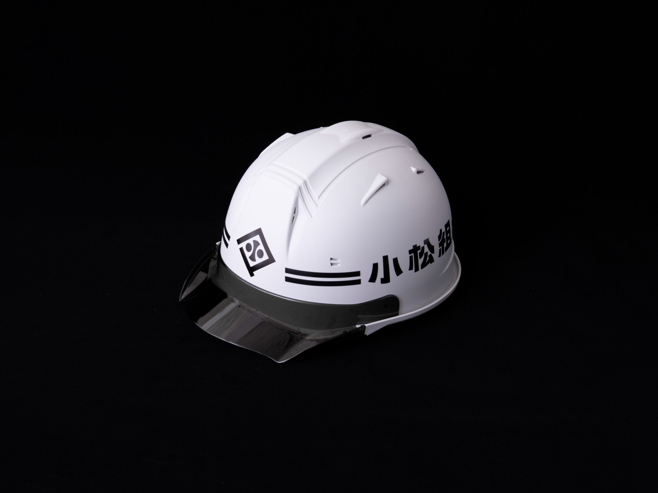
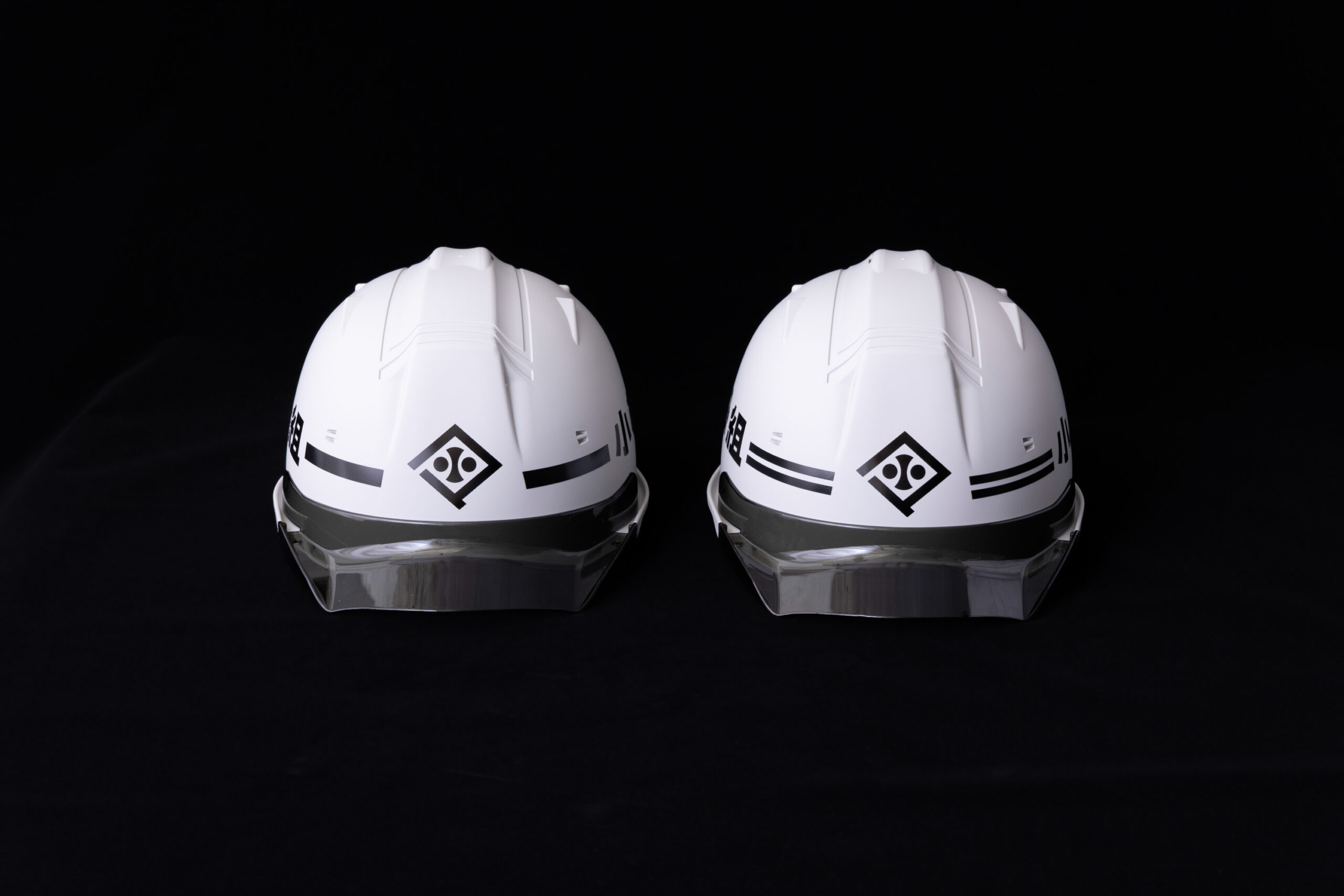
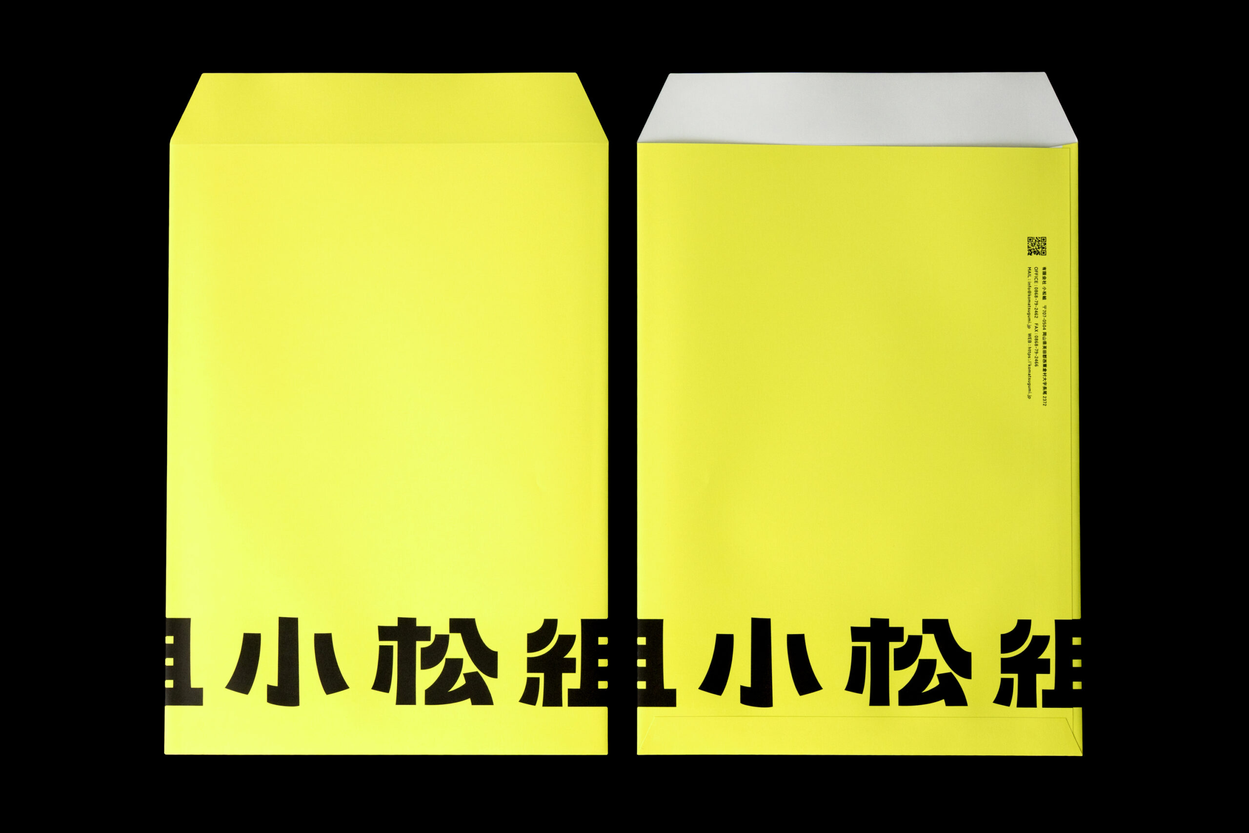
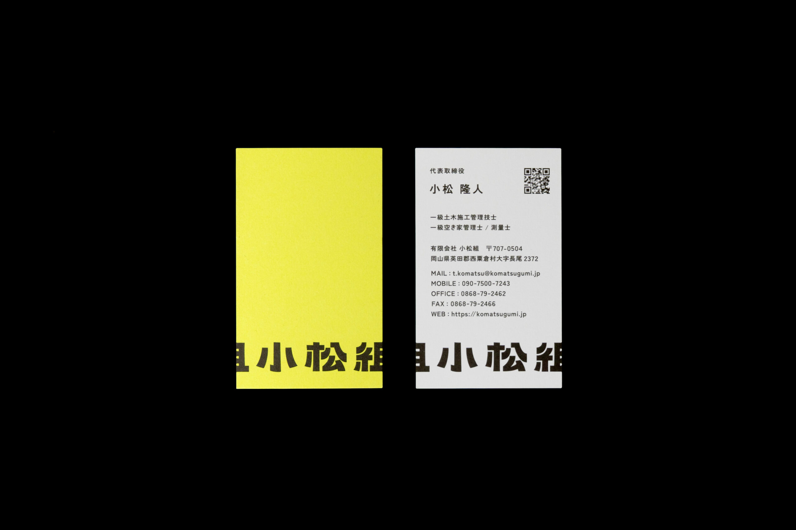
Out of these dialogues came the new purpose statement: With passion, we will ignite this village. Guided by these words, we revisited the brand colour system and applied it across the logo and all tools. The brand colour is a vibrant yellow inspired by warning colours at construction sites, expressing overflowing energy. The logotype translates Komathu-Gumi’s strong, straightforward and challenger-minded stance into typography. Even the generally taboo way of letting the logo bleed off the edge is intentionally codified as a rule, to embody a cool, boundary-breaking attitude that refuses to be boxed in as just another construction company and to visualise a brand that is always in motion.
This project made us keenly aware not only of the joy of being entrusted with such a bold decision as a full rebrand, but also of the breadth of what nottuo can and must take on, and of the responsibility that comes with it.
Project lead: Suzuki Jumpei
![]()
![]()